Analysis page walkthrough
Let’s walk through the analysis page and understand the basics.
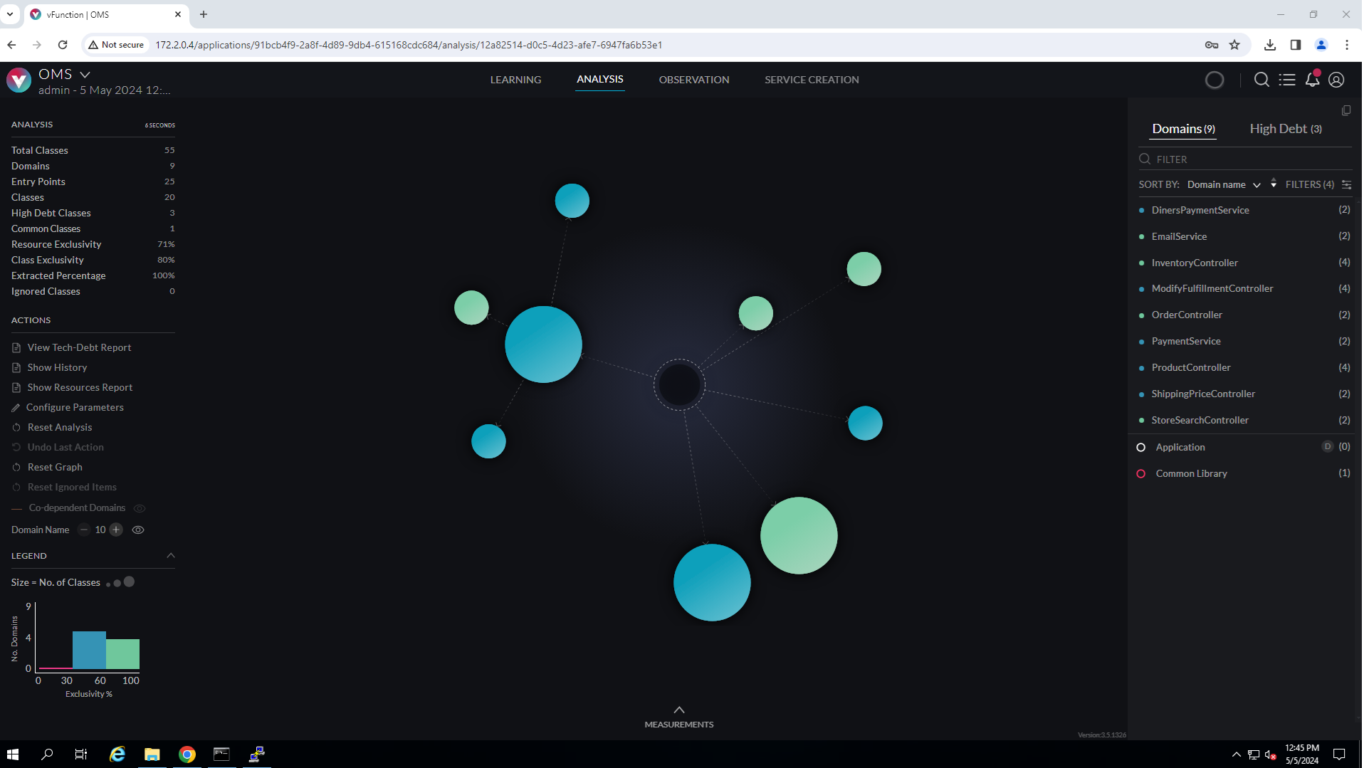
The center pane shows spheres representing the domains. The sphere’s size is proportional to the number of classes it includes. The color represents its exclusivity – the percentage of classes that are only used by the domain itself (exclusive to the domain). We will elaborate more on exclusivity later. The dashed arrows between spheres represent calls across domains. The calls can be seen when hovering over the arrows.
At the top of the center pane, we see four hyperlinks to navigate between the phases (Learning, Analysis, Observation and Service Creation). Every time a change is made to the domains during the analysis, the blue line under the Analysis label will show the progress of the auto-analysis run and a circular animation on the left pane will appear. The number under the ANALYSIS in the left pane shows the analysis execution time.
The magnifying glass icon at the top right is used for doing a string-based search for all elements in the measurement. The search support wildcards (e.g., *.abc*)
Next to the search we have a bulleted list icon to open the todo list (covered later) and next to that there is a bell icon to display notifications.

The left pane has several sections:
A menu labeled MEASUREMENTS which has various actions related to measurements such as selecting, importing, downloading, creating a snapshot, etc.
Analysis: provides a summary of the current analysis status, such as the total no. of domains, entry points, etc., and a summary of the total exclusivity measure of the domains. Under the ANALYSIS label a time measurement showing the last analysis execution time.
View: enables/disable display of information on the graph like displaying the domain names on the spheres, or highlighting any circular dependencies between domains (if they exist)
Actions: a set of actions concerning the entire analysis, for example, configuring the analysis parameters, showing resource report, etc.
A legend that includes a histogram showing the number of domains for each level of exclusivity,
The right pane lists all the domains. It has a filter field at the top to filter domains by name. Selecting a domain in the list also selects the corresponding sphere (and vice versa). Hovering over a sphere in the center pane will highlight the domain on the right pane.
Also on the right pane, there is a second tab labeled “High Debt” where architecturally high-debt classes are listed. In our case, OMS is a very simple application, so if you click on that tab you will just see ProductController, and even this class has a debt score under 4 (out of 10).
vFunction Analysis AI Agent
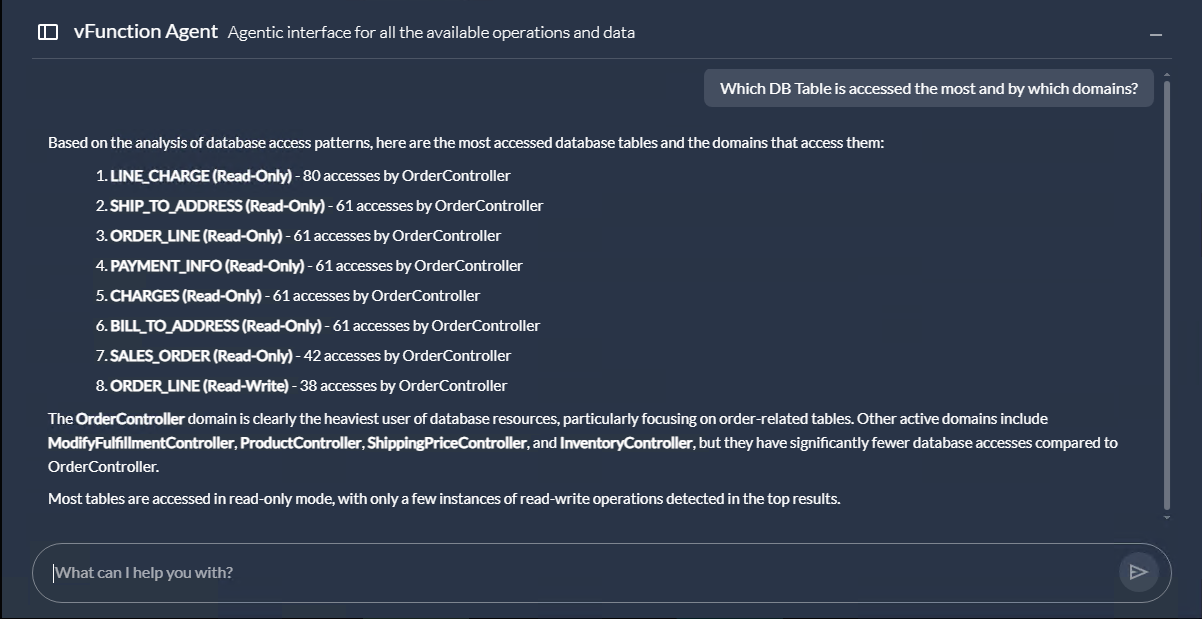
vFunction v4.5 introduces a new agentic interface that allows users to ask questions through an integrated AI agent. To access it, select vFunction Agent from the ACTIONS menu.
Here is an example session (question and answer):

Note that because responses are generated by an AI system, answers may vary.
Each session maintains its own conversational context, allowing you to ask follow‑up questions based on prior exchanges. To reset the context, start a new chat by clicking the icon in the top‑left corner of the vFunction Agent window.
